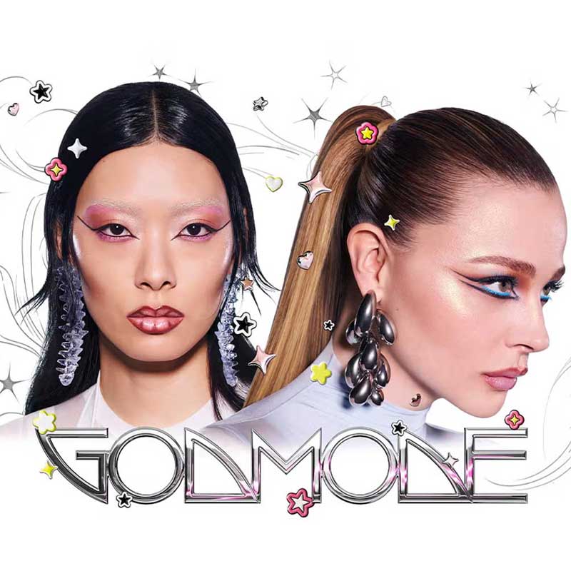
In an age of TikTok unboxings and vanishing attention spans, the way a brand dresses its product can seduce or alienate consumers before they even swatch a shade. Design decisions in materials, typography, color palette, and form factor can fortify a brand’s image and fuel its success in the cutthroat beauty market. The question is, can packaging make or break a beauty brand? Brands show that while packaging may not single-handedly make a brand, it does give one an edge and a hefty dose of cultural cachet.
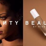
Lady Gaga’s Haus Labs is a case study in how a packaging reboot can resurrect a brand’s fortunes. When Gaga first launched her makeup line in 2019 as Haus Laboratories, the products didn’t quite scream Mother Monster. The initial packaging–black, standard, and a bit underwhelming–felt disconnected from Gaga’s avant-garde persona, and the brand soon faded into the background. By 2022, Haus Laboratories needed a reintroduction, and Gaga delivered dramatically.
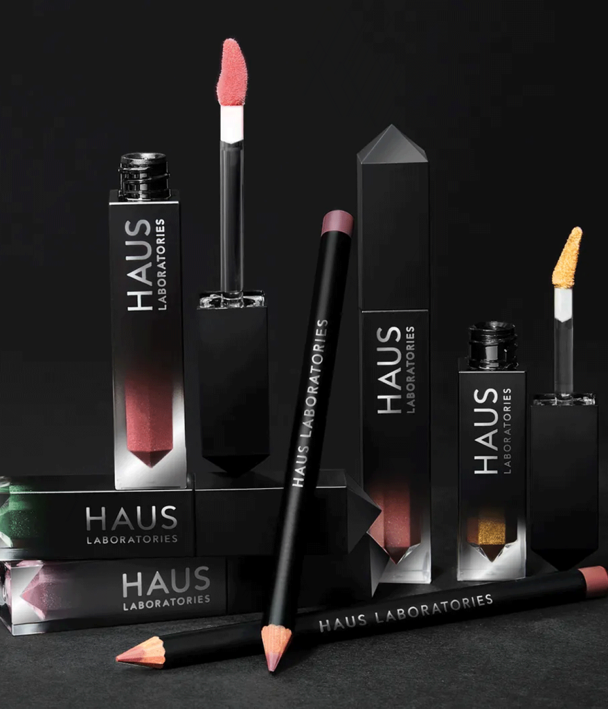
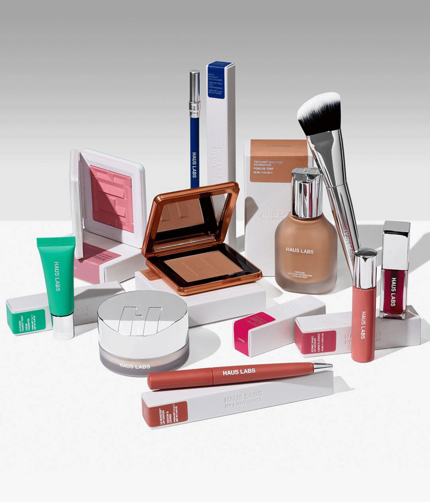
The brand re-emerged as Haus Labs by Lady Gaga, complete with a top-to-bottom redesign that infused new life into its packaging. The new look was “modern, chic, sustainability-minded, intuitive, and color-coded”–a far cry from the forgettable old black tubes. For example, In its rebranding, Haus Labs by Lady Gaga introduced the Triclone Skin Tech Foundation, featuring sleek, frosted glass bottles with minimalist design and metallic accents, consciously crafted from highly sustainable glass and aluminum in collaboration with award-winning designer Malin Ericson. The relaunch earned applause across the industry; Elle magazine declared it “one of the best things that could have happened to the company”. Indeed, what was once a celebrity brand struggling to find its voice suddenly had a visual identity as distinctive as Gaga herself. “At HAUS LABS, artistry is for everyone,” Gaga said upon partnering with Sephora, emphasizing that no one should have to compromise their values to be expressive.
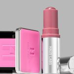
If Haus Labs’ transformation was about bold reinvention, Rare Beauty by Selena Gomez has been a lesson in staying true to your brand ethos. From day one–using packaging to reinforce a mission of inclusivity and kindness. Gomez launched Rare Beauty in 2020 with a clear message; break down unrealistic beauty standards and celebrate individual “rarity.” That ethos extended to the very feel of the products. Selena lives with lupus and as a result sometimes struggles with gripping objects, therefore Rare Beauty’s team engineered packaging that is easier to handle for people with mobility or dexterity challenges. This meant thinking outside the usual lipstick tube: many of Rare Beauty’s bottles and compacts feature rounded shapes and easy-grip elements–notably the signature spherical caps atop items like lipsticks and concealers.
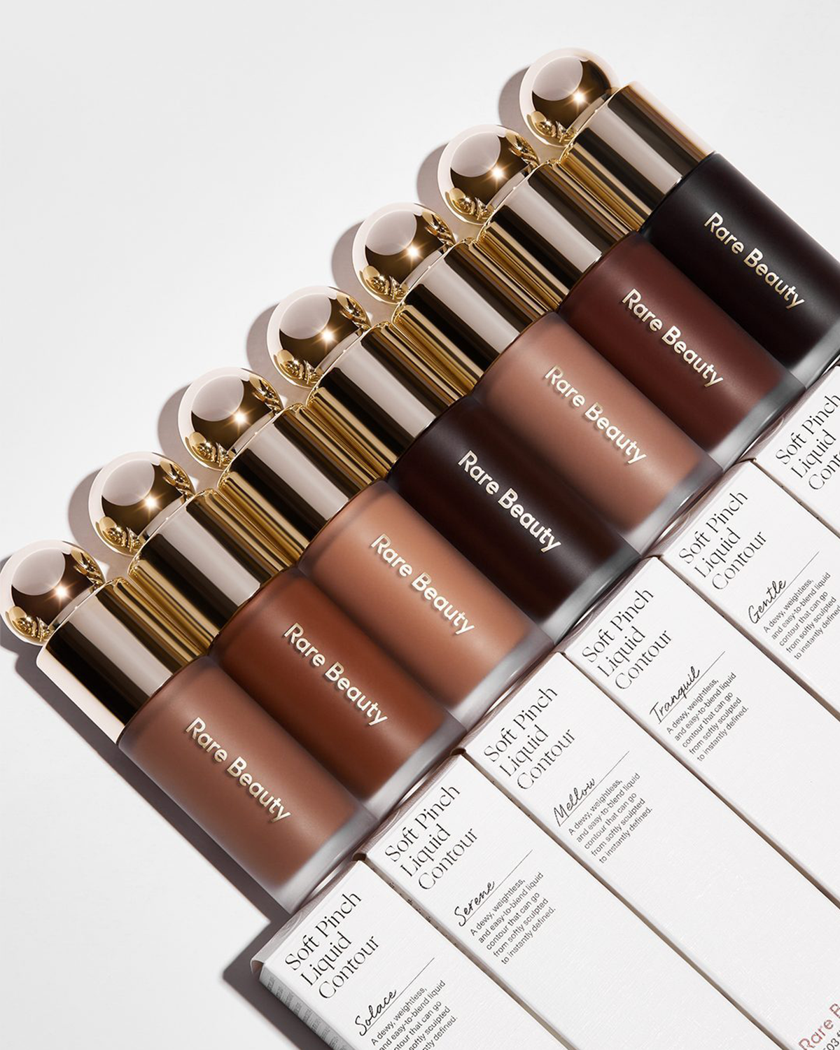
These pleasing orbs make it easier to unscrew and apply products for anyone, regardless of physical ability. “Because of my personal experience, I’ve always been drawn to packaging that’s easy to open and close, hold, and apply,” Gomez explained. The brand went on to launch a ‘Made Accessible’initiative to study and improve the usability of its designs, pushing the beauty industry at large to consider accessibility features. While the gentle curves and soothing color scheme–a muted, milky-peach hue with touches of gold–feels approachable yet elevated. In a crowded celeb beauty sphere, Rare Beauty’s packaging has set it apart as the brand that genuinely thinks of everyone–a perfect case of form following empathy.
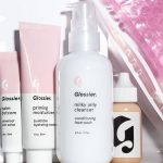
Before celebrity megabrands like Rare Beauty and Haus Labs ever appeared on our beauty shelves, Glossier was proving just how far a killer packaging aesthetic could take an indie brand. This brand made millennial pink a cultural phenomenon. From Glossier’s inception in 2014, Emily Weiss was intent on crafting products that were designed to be photographed and shared. The idea was to create packaging so delightful that customers would “take it out and take a picture of it, like you would food,” she said.
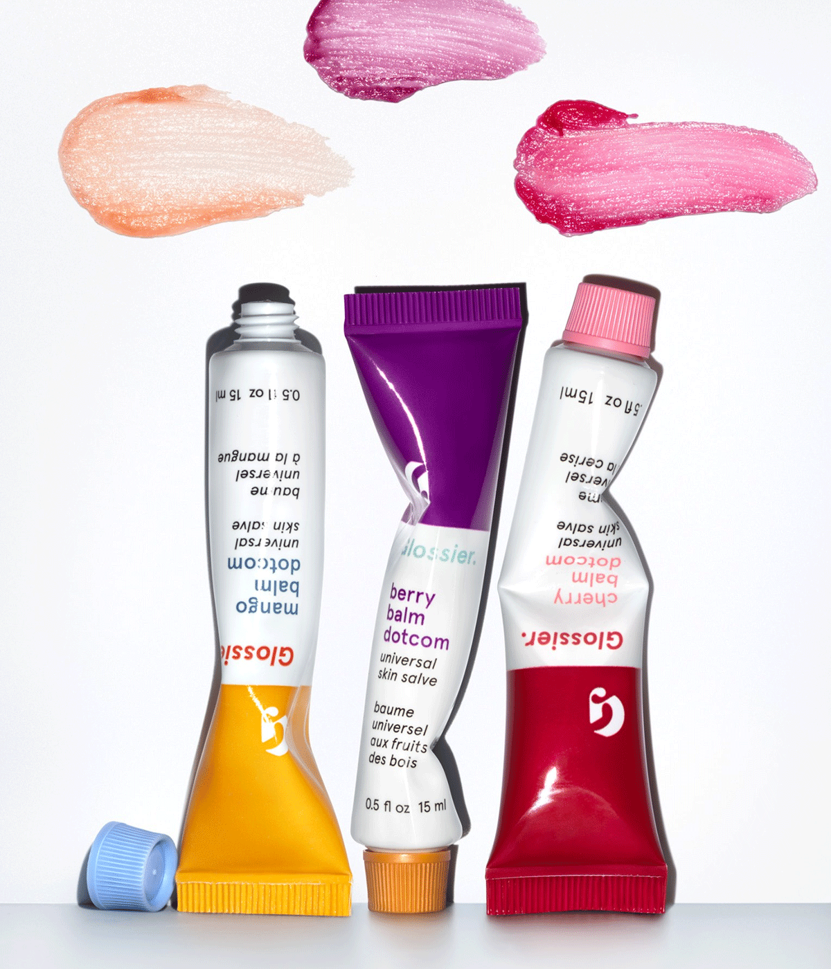
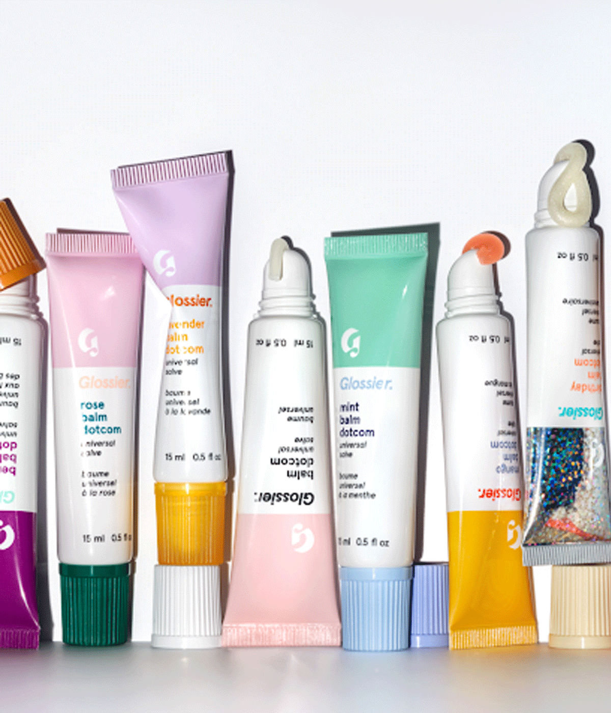
But even the most recognizable packaging needs to evolve, and in 2023, Glossier quietly updated Balm Dotcom, swapping out the old squeeze tube for a new slanted, hands-free applicator. The functional upgrade–cleaner, easier, more user-friendly–was well received. But when they also reformulated the balm itself to make it vegan, longtime fans weren’t thrilled. The outcry was loud enough that Glossier reversed course, bringing back the original formula inside the new packaging. The new tube stayed because it truly was better. The lesson? Packaging upgrades should enhance the user experience, not distract from it. When both product and packaging work together, the result is magic. When one falters, people notice.
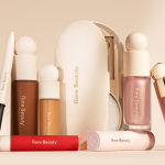
No discussion of beauty branding would be complete without Fenty Beauty, the juggernaut that redefined the industry in 2017 and set new benchmarks for inclusivity–all with some seriously savvy packaging. Rihanna’s Fenty Beauty famously launched with 40 foundation shades, an inclusive range that shook the competition to its core. The dominant color palette across Fenty’s line leans on soft neutrals–muted pinks, warm nudes, elegant whites. When you pick Fenty products up, you notice the geometric motifs running through the line. Instead of generic round tubes, Fenty embraced angular shapes–the Gloss Bomb lip gloss, for example, comes in a prism-like octagonal tube, while the Killawatt freestyle highlighter is housed in a faceted compact. Small details–like product quotes printed inside packaging–turn each item into a keepsake.
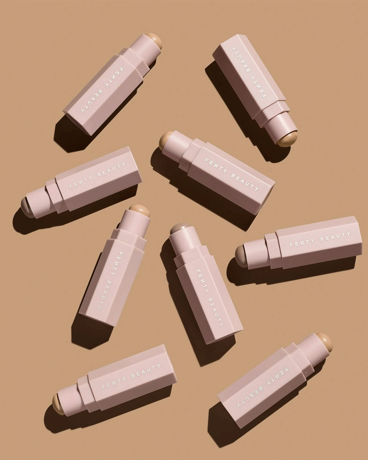
True to its inclusive promise, Fenty has continued to tweak designs for accessibility and sustainability too. (Notably, by late 2021, the brand began phasing out the magnetic snap feature in its Match Stix packaging to make them fully recyclable, showing that even a fun gimmick will be sacrificed to “do better” environmentally. It’s no wonder Fenty’s sleek tubes and compacts have become status symbols in their own right, plastered across social media and proudly displayed on vanities around the world.
What all of these brands have in common is an understanding that packaging matters. The aesthetics and design decisions–the weight of a cap, the shade of pink, the twist of a tube, the font of a logo–all contribute to a consumer’s perception of value and identity. These brands have been culturally aware, even prescient, in translating beauty ideals into design. In a saturated market, that can spell the difference between a fleeting trend and an enduring cult favorite. Does packaging make or break a good beauty brand? It certainly helps make one. Just ask the millions of customers who fall in love with a certain pink bubble wrap pouch, or a foundation bottle that finally felt like it was made for them.