One brand has a hit, and suddenly everyone seems to be offering a version of it. The same lip oil, the same blush shades, the same muted pastel packaging. What we’re left with is a boring sameness where everything becomes interchangeable.
There are excellent products within that repetition. I love a beautifully judged neutral, and a familiar formula can earn its place by doing something particularly well. What wears thin is seeing the same handful of ideas presented, again and again, as something new. It is becoming harder to recognise a brand by its choices rather than its logo.
Color is where I feel that lack of imagination most. An interesting shade can change the way you think about a face. A brown with an unusual undertone, a red that leans sharply orange, or a translucent color with an unexpected reflection can suggest an entire makeup.
A trend should give creators something to build on. A color or finish that catches their attention can inspire a different texture, an unexpected combination or a new way of using a product. I want to see where someone takes an idea once they bring their own taste and references to it. Simply repeating what is already popular leaves out the part that makes creating makeup interesting.
The six brands below caught my attention because each has a discernible point of view. Some are experimenting with color and finish; others are reconsidering the compact, the materials we touch, or the references behind a collection. Together, they offer a more interesting conversation about what a new makeup brand can contribute.
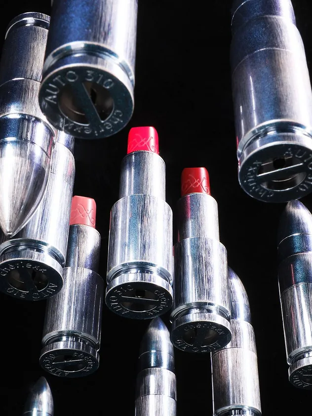
Chériexx approaches makeup with the attitude of an accessories label. Its gold and silver bullet-shaped cases, optional chains and charms make the lipstick part of the way you dress. There is something appealing about a cosmetic object designed to be seen and carried, with the same attention you might give a piece of jewellery.
The color ideas deserve attention too. Alongside The Bullet Matte Rouge and sheer lip colors, Glow Wear Highlighter offers a more playful approach to reflection. The shade Wear My Youth combines a peach base with red and lemon-toned glitter. That is a specific color decision, and one that makes me curious about how the different tones will read on skin.
It gives the brand more substance than a clever lipstick case alone. The packaging establishes a fashion sensibility, while those less predictable combinations of pigment and sparkle give you something to explore in the makeup itself.
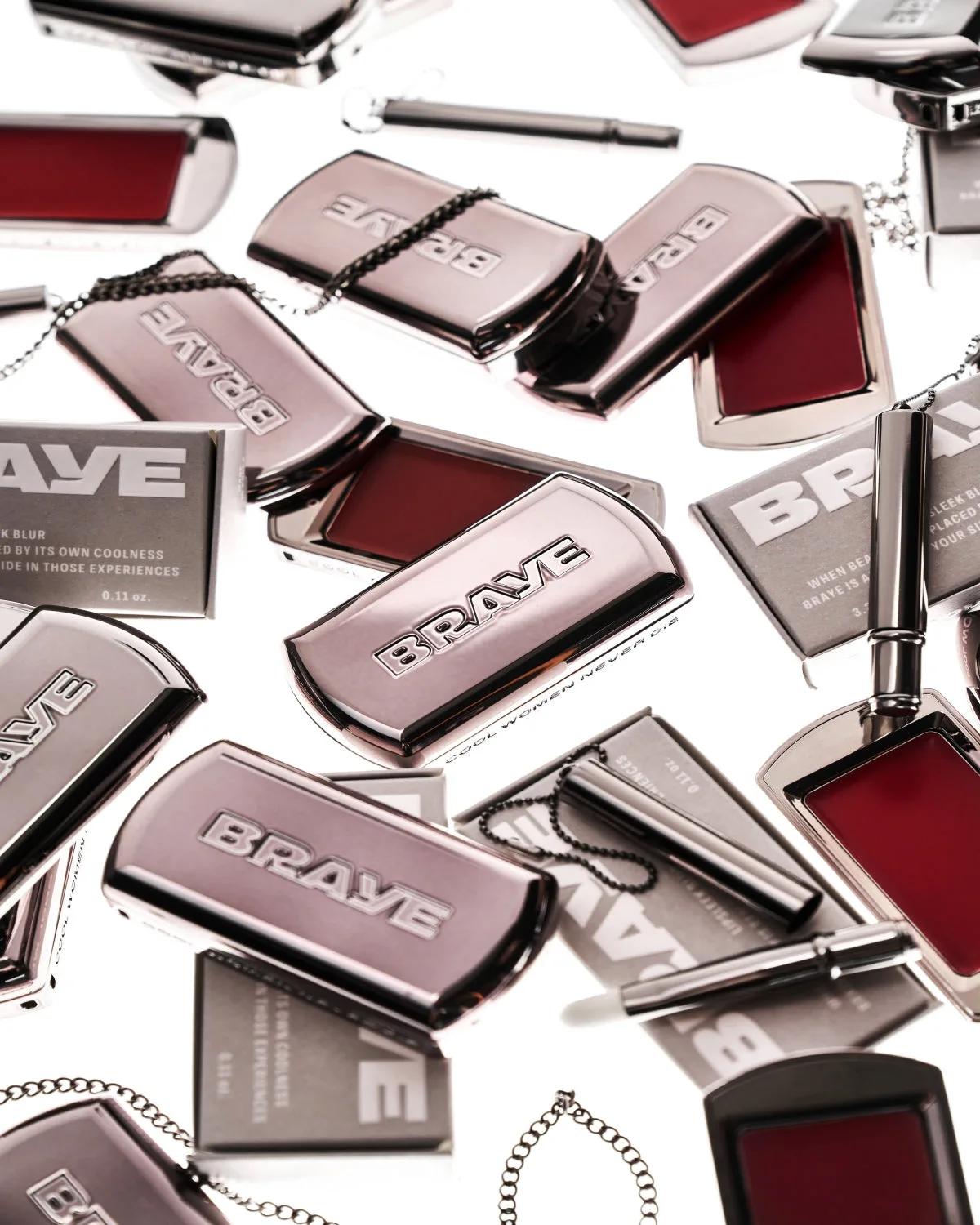
BRAYE takes a more utilitarian approach. Its Lipsleek lip-and-cheek color comes in a slim sliding compact that can attach to a strap. The object has an immediate logic: color kept close at hand in a compact designed for touch-ups. Glossy and blurred versions allow for different effects within that compact format.
That relationship between design and application is what interests me. A pan of color invites you to pick up a little, press it into the lips or work it across the cheeks. The same shade can become a soft suggestion or a stronger feature depending on how you apply it.
BRAYE’s loose, slightly undone approach feels consistent with the case. Its identity comes through in the kind of makeup it encourages you to make, and in how naturally the product could fit into the rest of your day.
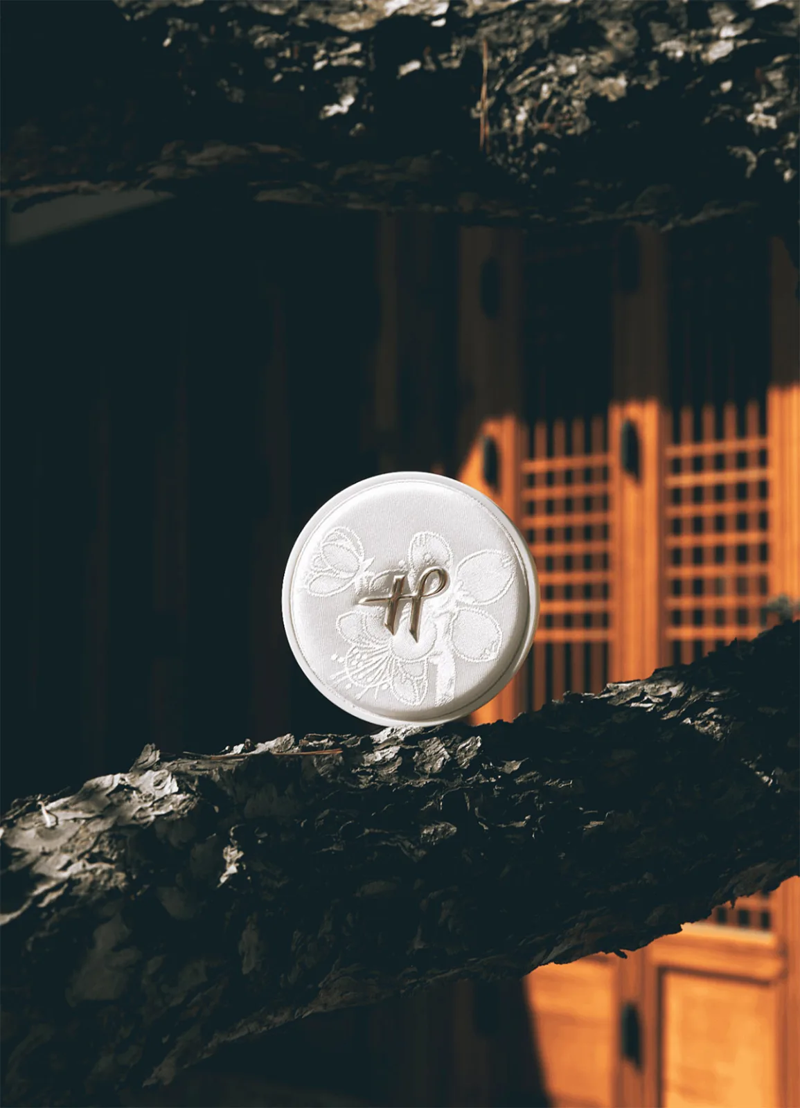
HWIRAN has one of the clearest cultural perspectives in this group. The Korean brand draws on traditional craft and painting, with a Maehwa Silk Cushion compact covered in artisan-woven hanbok silk and a Sumuk Eyeliner inspired by ink-wash painting. Those references give familiar makeup categories a particular visual and tactile identity.
I like the connection between the products and their source material. Silk brings color and texture to something you hold; ink painting suggests a way of thinking about a line, its weight and the space around it. Those references give HWIRAN room to develop its own ideas about color and application.
HWIRAN’s strongest contribution is that connection to Korean craft and painting. It gives the small range a character of its own and makes me want to see how the collection develops.
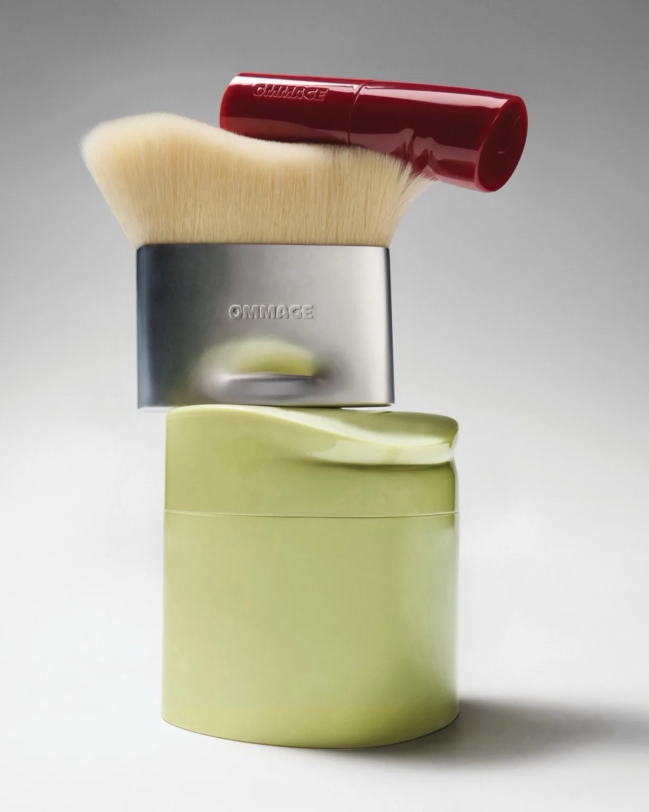
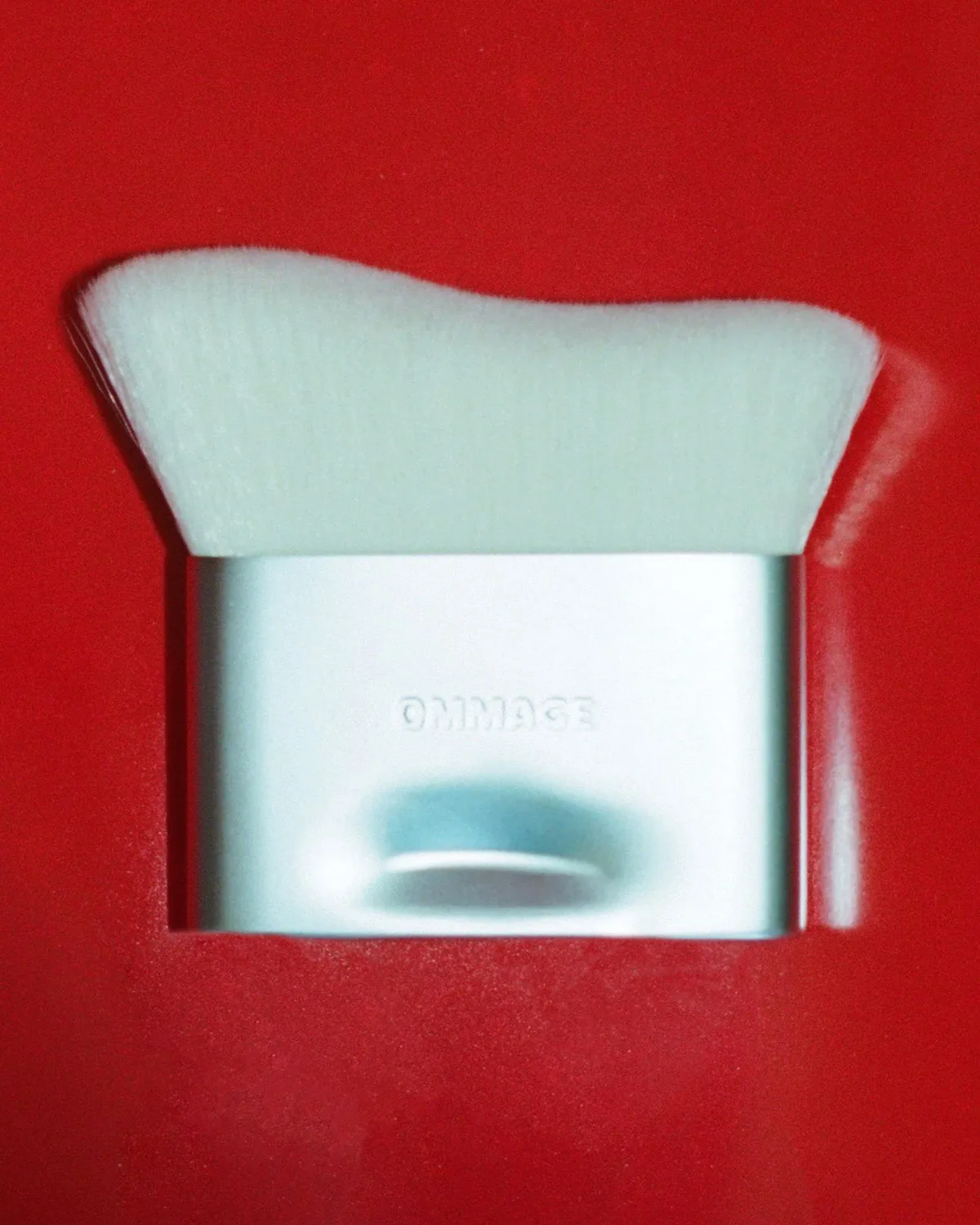
Ommage, Lara Worthington’s new brand, begins with a tightly edited collection: First Base skin tint, Lip Coat lipstick and the Buffer Brush. The packaging, developed with artist and graphic designer Brian Roettinger, has deliberately dented and softened shapes. The glossy red lipstick cases look like small sculptural objects, with an irregularity that gives them character.
The lip colors bring welcome energy to that design. Vibrant reds and bold oranges sit within the opening range, and Lip Coat is designed to build from a soft stain to more saturated color with a blurred, velvety satin finish. A strong orange against lightly evened skin already suggests a complete look.
That is what makes the small collection interesting to me. It offers a clear relationship between complexion and color, with enough intensity in the lipstick to give the face a point of focus. The edit feels considered, and the packaging makes it recognisable.
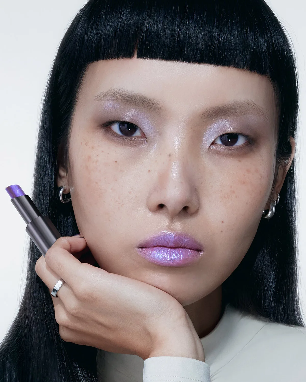
Hyrular makes the strongest case here for color as something you discover through movement. Created by David José, Bryan Huynh and makeup artist Mollie Gloss, the brand launched with Nebubalm, a sheer, buildable multichrome lip balm. Its pigments shift with the light, producing a pearlescent effect that adds another dimension to the underlying color.
Nebubalm offers a new play on iridescence and color shifts through its sheer balm format. The natural lip remains part of the result, and the brand also suggests layering it over liner. That opens up possibilities for changing the depth and contrast beneath the reflective finish.
The metallic packaging and surreal imagery make sense beside that formula. They describe the same interest in transformation. Of these six brands, Hyrular most directly answers my wish for a lip product that makes me think about color differently, with a finish that can become part of the composition of a makeup.
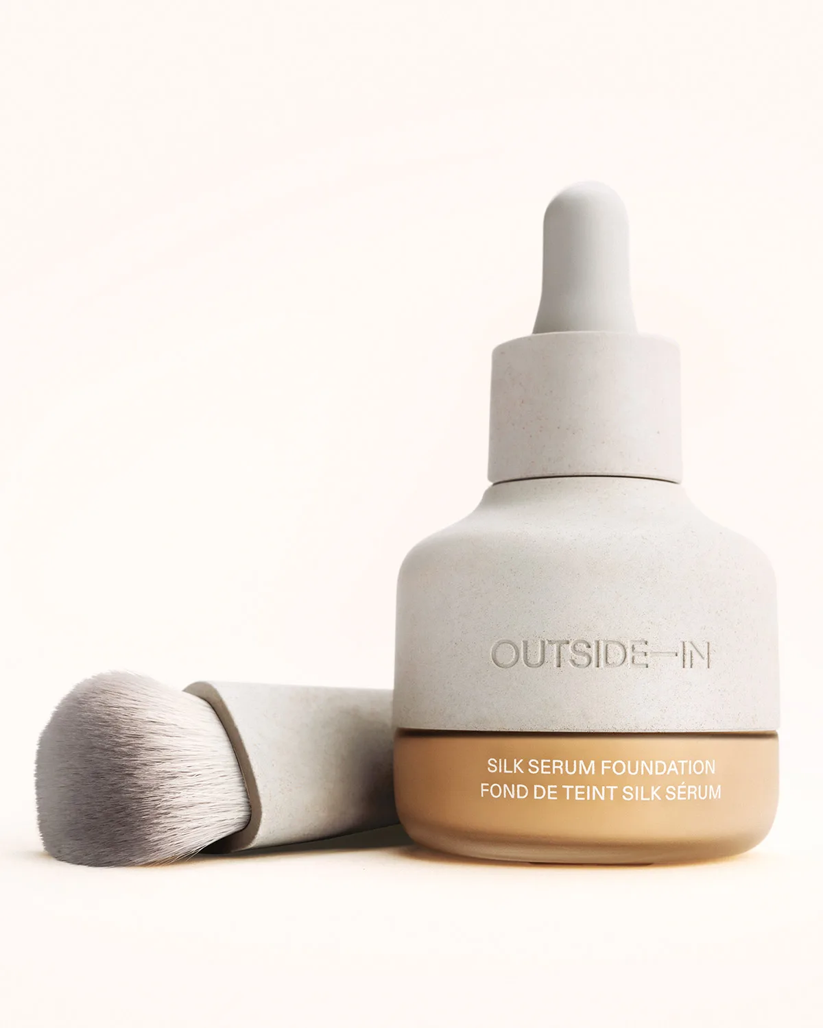
Outside In shows how a restrained brand can still have a distinct identity. Founded by Carisa Janes, it builds its first collection around light on skin. Silk Serum Foundation offers buildable light-to-medium coverage, while the tactile, stone-like packaging introduces a material quality that feels connected to the natural world.
The brand’s packaging uses materials including rice husk bio-resin, limestone and glass. That attention to surfaces carries through to the makeup concept: complexion, texture and the way light changes what we see. I can understand the relationship between the object and the intended finish.
Outside In’s place in this selection comes from that coherence. A complexion brand can express a point of view through its approach to skin and its choice of materials. The restraint feels purposeful, which is very different from reaching for an anonymous neutral look by default.
What I want from a new brand is the feeling that someone has made choices because they believe in them. That can mean a peach highlight shot through with red and lemon, a sheer balm with a shifting reflection, or a compact that brings a particular craft into everyday use. There should be a reason for the product to look and behave as it does.
I want more of that curiosity in beauty. A trend should encourage creators to experiment and develop something of their own. When it only produces more of the same, beauty becomes bland.
These six brands give me reasons to pay attention. I’m curious to see how their ideas develop. I want to be excited by a product because it could only have come from that brand.